Wednesday 21 December 2016

Research and planning – advert: Drafts of adverts

Drafts of adverts

Once we identified the details that we associated with our music video and advert such as the artists name, album title, key singles, release date and other generic conventions associated with the advert, we created drafts of our advert. This allowed us to make numerous changes after receiving feedback from our target audience, this helped us make the final advert effective and suitable to meet the target audience's standards, encouraging them to promote the album through either word of mouth or social media, which would make more people aware of the album. We identified the importance of an advert as it will be exposed to a mass audience and is used to encourage them to buy a product. Therefore, we understand that the presentation our advert and use of conventions are vital to ensure the album and artist's success. 
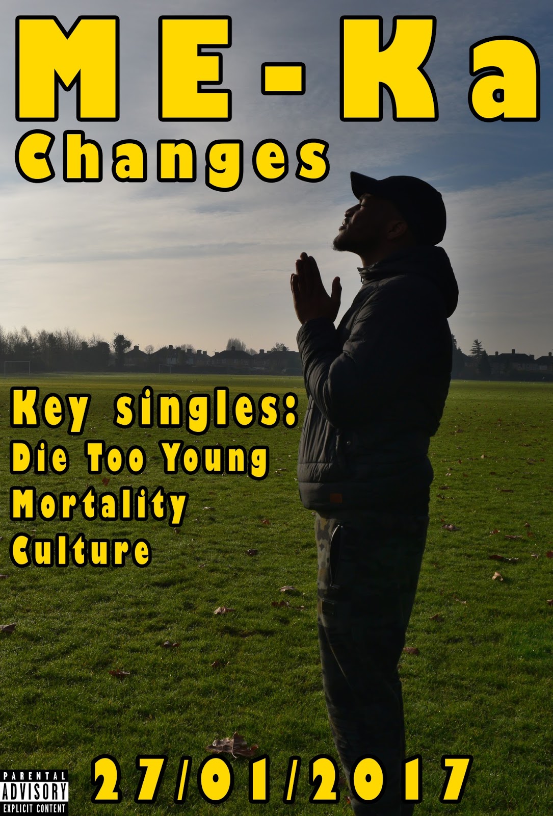
Draft 1:


Analyse your use of conventions using PEER:

  • An image is included of my main artist who is wearing dark clothing and a hat, he is not facing the camera and is looking up. This is portrayed in a long shot cropped down to a portrait shot to fit the size of an advert. This is conventional as it gives off the theme of hope and makes the artist look mysterious.
  • The background image is very simple with only the grass, some trees and the sky to be seen, this is so the artist is the focal point of the image.
  • The layout of the information is neat and the information does not look too cluttered. This draws the audience to the advert as there is not too much to read on the advert.
  • The information I have included is conventional which is the artist name, album name, key singles, the release date as well as the parental advisory label. This information is all relevent to the proper release of the advert and is therefore conventional so the audience are aware of the most important things.
  • No sub images are included, this is to avoid confusion.
  • The unconventional part of this advert draft is the theme of hope and the lack of star image on this advert as the artist is seen looking up and appears to be praying.
  • Adorno and popular culture - The advert generally follows convention to appeal to a mass audience, however the image of the artist is unconventional as he is not appealing in the advert due to not looking into the camera which is conventional. The advert is targeted for the masses but due to it being the genre of hip hop it may not appeal to the bourgeoise.
  • This advert allows my artist to promote their different ideologies and values as he is dressed as a typical young working class male and can be seen as promoting the idea of hope.
Audience feedback - Natalie, 18.

What did you like about it?

Image is very interesting and shot well
Typography is clear and is consistent with digipak as well 
Release date, artist title and album title is clear.

What did you not like about it?

Cannot see artists face
Typography colour does not go well with the image

How can it be improved?

Consider changing typography colour
Consider changing image as artist image is not clear of who he is.
Add where I can stream and buy the album

Draft 2:


Analyse use of conventions using PEER

  • I have included an image of my artist and he is looking away, this shows that he is mysterious and can promote the idea that the audience should find out more about him.
  • The artist image shows him wearing a hoody and tracksuit bottoms with the hood up, this is so that he is shown as a typical young working class male and therefore can relate to a mass audience and is he relatable to the target audience.
  • The typography can be seen as promoting the theme of sadness and death, which are the themes of the album although there are others.
  • The advert itself is in black and white or grayscale, this is to show how varied the album is as white could represent purity and innocence while black could represent darkness and have negative connotations.
  • The fonts and the information on the advert is clear and and neat , there is little information on the advert itself so people can stop to read it easily.
  • The language I have used is simple so that our target audience who are mainly working class people are able to understand it properly.
  • There are no sub images, confusion is prevented this way.
  • Adorno and popular culture - this follows popular culture as it is a conventional advert with simple imagery and text and therefore appeals to a mass audience. The image of the artist is typical for the hip hop genre and a lot of the audience can be drawn in this way. The advert is targeted for the masses but due to it being the genre of hip hop it may not appeal to the bourgeoise.
  • Dyer's star image, star image is evident in this advert as the artist is clear in the advert so he can become a recognisable brand.
Audience feedback - Daniel, 20.

What do you like about it?

The black and white editing is done well as it is not too much of either
The artist image is clear
I can see where I can buy and stream the album

What do you not like about it?

The typography is a bit too dark and does not clearly contrast with the background image
The layout is cluttered

How can it be improved?

Change the colour of some of the text
The key singles should be clearer
The layout should be spread out more

Conclusion:

In conclusion, the drafting process has been vital as it has helped us develop our product further based on the feedback we received. We were able to make some changes and come to a decision on which draft we were to use. Our final advert was conventional enough to appeal to the mass audience and our target audience and certain parts of it such as the clothes the artist wears and the editing used on the advert allowed for us to target niche audiences. We picked draft 2 as we thought it was extremely important to promote our artists star image to ensure he becomes a well known brand, especially as it is his debut studio album. If we had not drafted our advert we may have made an unsuccessful advert which would not have reflected our genre and may not have reached the target audience the way we had hoped for.


Tuesday 20 December 2016

Research and planning – Digipak: Drafts of digipak

Drafts of digipak

After identifying the most common details associated with our digipak such as artists name, album title, track list, parental advisory label and bar code - we created drafts for our digipak. This allowed us to explore different software and be creative to make it as appealing as possible to our target audience. We also took in feedback which allowed us to meet the target audience standards , this identified the importance of the digipak and the correct presentation and use of conventions were vital in ensuring how successful the album would be.

Draft 1:


Analyse your use of conventions using PEER:

  • I have included an image of my artist and he is looking away from the camera, he is mainly wearing dark clothing which is captured with a medium shot - this is conventional as it makes my artist look mysterious and does not make the audience aware of what his intentions are.
  • The title of my album is "Changes" which can intrigue the audience as they could have their own interpretation of the word, also it suggests that a story will be told.
  • The low key lighting as well as the use of the blue and purple gradient creates a mysterious and intriguing atmosphere and mood. This is conventional as we are inviting the audience to discover more with this artist.
  • The typography contrasts the background but also stands out, this yellow/gold colour can give off the idea of hope juxtaposing the negative connotations the dark themes may have.
  • The overall layout is neat as everything fits properly and it does not look too cramped, this is conventional as the most important image of the artist is clear.
  • The second image I have used is a train and can be linked to travel which can also be linked to the album title of changes, this further intrigues the audience leaving them wanting to know more about the album and what it contains.
  • The language I have used is simple as the audience should be able to relate to it easily as my target audience are predominantly working class and I wish for them to understand it.
  • Adorno and popular culture: This digipak follows most conventions and therefore is not going against hegemony, it is appealing to a mainstream audience due to the dark colours and the low key lighting, the artist does not look entirely relatable but his costume can be seen as conventional for those of the hip hop genre.
  • ME-Ka is seen as promoting his culture and ideologies as he is dressed as a typical working class young male, representing them for their masses.
  • Hebdige's subcultures: This digipak can also relate to the hip hop subcultures as well as others as it looks like a conventional hip hop album, very few hip hop albums are entirely about positive things. 

Audience feedback: Victoria, 18

What do you like about it?

Front cover

The title is clear
Very consistent with colours and text
Artist image is quite clear and intriguing 

Back cover

Gradient colour is nice as opposed to the same colour as the front
Image of train is interesting

What did you not like about it?

Front cover

The artist looks confused in the image
The artist name is not on the front

Back cover

The track list should be more clear and sizes should be changed.


How can it be improved?

Front cover

The artists name needs to be added to the front
Make the image of the artist brighter


Back cover

More information such as artist name on the back
Distributing company logo can be added
Production details on back cover need to be added

Draft 2


Analyse your use of conventions using PEER

  • I have included an image of my artist and he is looking away from the camera, he is wearing all black which is captured with a medium shot - this is conventional as it makes my artist look mysterious and does not make the audience aware of what his intentions are.
  • The title of my album is "Changes" which can intrigue the audience as they could have their own interpretation of the word, also it suggests that a story will be told.
  • There is a darkened image of my artist which has tones of blue with low key lighting, this adds mysteriousness to his character which should intrigue audiences.
  • The typography contrasts the background but also stands out, this yellow/gold colour can give off the idea of hope juxtaposing the negative connotations the dark themes may have.
  • The red colour of the background represents blood, sorrow and pain which contrasts with the typography.
  • The layout of the front and back images is consistent and works well as whole as it is simple.
  • The language I have used is simple as the audience should be able to relate to it easily as my target audience are predominantly working class and I wish for them to understand it.
  • Adorno and popular culture: This digipak follows most conventions and therefore is not going against hegemony, it is appealing to a mainstream audience due to the dark colours and the low key lighting, the artist does not look entirely relatable but his costume can be seen as conventional for those of the hip hop genre.
  • ME-Ka is seen as promoting his culture and ideologies as he is dressed as a typical working class young male, representing them for their masses.
  • Hebdige's subcultures: This digipak can also relate to the hip hop subcultures as well as others as it looks like a conventional hip hop album, very few hip hop albums are entirely about positive things. 
Audience feedback: Matthew, 19

Strengths - 
Colours and text is consistent
Typography is clear and juxtaposes the background well - stands out (which is conventional)
Good artist representation - it is intriguing 

Weaknesses - 
Image of artist too dark
Parental advisory label missing from front cover
Artist name is missing on either cover
No production information


Conclusion:

The drafting of the digipak process has allowed us to create a final digipak which has been built from the constructive criticism we received from the feedback. The changes we made included changing some of the spacing of the typography, as well as adding a parental advisory label to the front cover and the artists name to the back. We chose not to add his name to the front as we wanted him to seem like an established commodity who is recognised via his star image. A barcode was also added for when the album goes on sale as professional digipaks have this. The drafting process was vital and it was effective as we were able to understand the small issues with the quality of the digipak, without it it would not be as successful. 


Friday 16 December 2016

Research and planning – Digipak: Identifying conventions and analysing existing digipaks

Identifying Conventions and Analysing Existing Digipaks

Purpose:


  • Marketing tool that sells/promotes the album
  • Displays indirect information such as the ideologies of the artist
  • Creates, adapts or feeds into representation of 'star image'
  • A product to keep hold of, can be a collectors item
  • Attract a particular target audience
  • Buy into artist lifestyle and ideas
  • An everlasting product that will symbolise the artist and the album
  • Form of synergy - advertising and promotion
  • Creates a relationship between the artist and audience


What are the generic conventions?

The generic conventions of a digipak includes:

Artist image
Tracklist
Parental advisory label
Record label
Barcode
Album title
Company details
Critical details
Critical sticker

Analyse two examples that are similar to your genre/artist:


Conclusion:

How has this research given your group ideas on what to include in your digipak?

This research has been extremely beneficial to our planning process as we now have a better understanding regarding our digipaks. We are also able to identify their purpose which is that they are marketing tools used to sell and promote an artists album to the audience and is what determines a success of an album. Furthermore, we have also disserved what the generic conventions of digipaks are. As a result, we will be following the generic conventions in order to secure the success of our digipak also making sure that it looks professional which will encourage audiences to buy the product. After we analysed existing products from similar artists from the hip pop genre, we also identified that these digipaks consistently use dark colours and simple with important information so that the audience are aware of it. We decided to follow this convention and go with dark colours ourselves to promote the dark mood which also reflects the songs in the album. We only included relevant information to prevent the audience of getting bored. Overall, by following these generic conventions and being influenced by digipaks from similar artists and genres, we believe that it has a high chance of being successful, drawing our target audience of what they're use to seeing in mainstream hip-pop.

Wednesday 14 December 2016

Research and planning – advert: Advert information

Advert information:

What information will you include in your advert?

Album name:

The name of the album will be "Changes", this is a quick and easy to remember title, which will also hopefully intrigue the audiences as the tracks on the album relate to this title.

Release date:

Our chosen release date will be 27th January 2017, this is right after the 10th January press campaign and the 14th January TV launch. The TV launch should help the artist get as much recognition as possible prior to the album release. The album will also be released on a Friday which has been specifically chosen as most albums are released on Friday's to ensure as many people are able to listen to it.

Downloading availability:

We have reached out to well known streaming sites and have come to an agreement to stream the album on the following, Spotify, Apple Music, Soundcloud, Amazon Prime Music and Google Play Music. These are all also available to download provided customers have the correct subscriptions. All of these services have the most number of users which is within the millions, it will therefore allow the artist to become a lot more successful and easy to reach. Giving the audience multiple platforms or applications to download the album on can ensure success.

Key singles:

Die Too Young, Culture and Mortality. These are key singles as they have taken the longest to record and are the first songs written by the artist. These songs also have the widest appeal for our target audience, also express the themes the most out of the whole album, although the whole album does so.

Explicit lyrics label:

We will be including the explicit lyrics label as some of the songs do contain profanity and some sexual language, it is important to inform the audience that the album is not suitable for listeners under the age of 18 or those without parental supervision.

Setting of image:

Images will be captured outdoors, and with brighter backgrounds to express the theme of hope. The text and the background colour however may be contrasting to this to show how varied the album is in terms of tone. Overall the images will be engaging and unique to conventional hip hop album adverts.

Costume, hair and makeup:

The artist usually wears darker clothing and on a day to day basis wears typical clothing as a young male from an inner city. This means he will be sporting tracksuits and large jackets and a hat, this should show the artist as someone who is conserved as he is upset inside and has been through a lot, but the contrast with the brighter background can show that he is able to express himself.

Cinematography:

After studying existing adverts, we learned that most of the images captured are close up or medium shots of the artist, this is to make sure that they are the focal point of the album and the advert. This is suitable for the star image of the artist but may not express the theme of the album as much. We will most likely vary between long shots and close up shots, ultimately deciding which is more effective for the artist as we believe expressing the themes of the album is very important.

Lighting and colour of advert:

The lighting and colour of the advert will be contrasting as we wish to convey a theme of hope, which can be interpreted very differently if not executed properly. It will not be so contrasting that the advert is difficult to look at, rather it will be unique and eye catching, the artist image should reflect the mood of the album, but the colour and lighting will express the themes. The main colour scheme will involve blue as it is a neutral colour and can be seen as something positive such as hope.

This information is vital as these factors within the advert are essential in contributing to a successful music video.


Tuesday 13 December 2016

Research and planning – Advert: Creative brief

Creative brief for advert:

Who are they?

ME-Ka is a songwriter, singer, record producer and actor who initially was an actor who had minor roles in low budget television movies from the age of 12. At 15 he started singing, songwriting and producing music which lead to underground recognition and recognition within his community. He then began performing at small clubs and small local festivals, eventually releasing 2 EP's and a mixtape on websites such as DatPiff before signing to D-T records, where he then began helping write and produce other artists music from the same label. He has just returned from a European tour and as it had sold out he had established an International status as a hip-hop artist and will release his debut album under the D-T records label.

The album concept:

We wish to establish an album cover that will represent ME-Ka's star image in the best way possible. This is to attract a variety of different audiences between the ages of 18-25, from all ethnic and social backgrounds, but mainly aiming at those of working and skilled working class backgrounds. This is because they are more likely to be able to relate more to the Hip-Hop genre. Our album should be reinforcing ME-Ka's ideologies and beliefs, and hopefully also appeal to hip hop subcultures as well as a mainstream audience. However the designs of the album cover will hopefully be different and not necessarily conventional as it should be unique enough to show the mainstream audience that ME-Ka's style is different. This way it will allow the artist to be even more internationally recognised, to not just ensure domestic  success alone.

Why are we doing it?

We are creating an advert as it is an effective source of synergy which will help advertise and promote the album. We hope that the advert will be perceived by a large, mass audience by being advertised on billboards, magazines, bus stops, buses and as posters on the street, these platforms are all easily accessible by large audiences. The advert should also help the artist gain more recognition by making him more popular within the industry as hopefully be more recognised on social media which will be vital for his come up. The album will hopefully be sold on an international scale as well as domestically, the advert should appeal to the hip hop subcultures as well as a mainstream audience, whether they are already aware of the artist or if they are just looking for new music. To make sure the advert is successful, we will ensure it has usual conventions of adverts for hip hop music artis, such as a clear and appealing image of the artist, with large and clear typography and colours and lighting which will reflect the mood we are trying to put across.

Comparable products;


These adverts can be compared to the advert we are making as they contain the similar colour scheme we wish to use to portray the themes of hope. It also promotes the focal point of the album as there are close ups of the artist, this is important as the album is very self centred on the artist. The lack of facial expression also makes it difficult to read the artists mood and can therefore be interpreted differently.

Audience

The demographics of our target audience include, working and skilled working class people, aged 18-25, any gender and ethnic minority. It is broad therefore it can reach the widest audience and can relate to as many people as possible. We wish to also educate those about ME-Ka and his roots, coming from a lower/working class background but getting commercial success allowing him to succeed. The advert should help the sales dramatically and the audience should be able to look at the advert and be intrigued by the design of it, as this may be the first time they are seeing this artist.

How will we know that it has worked?

The amount we sell in the first week of the album release, as well as whether it gets on international charts and holds its position, also the general feedback from both critics and audiences. A focus group will be held with people between the ages of 18 and 25 who fit our demographic. They will be shown drafts of the album designs and give us feedback, this allows us to make the correct changes and take on constructive criticism which allows us to create a final draft which will be the most appealing to the target audience. For the album to engage the target audience is very important as it could determine how successful the album is, we will use our feedback to ensure the album is affordable for our audience as well as learn what they like and do not like about it.

Launch dates:

ME-KA's campaign dates:

Press Campaign: 10th January 2017
TV Launch: 14th January 2017
Album release: 27th January 2017

Limitations that may occur:

Consistency may be an issue when making the three products for the digipak, to ensure this though we must continually update and keep editing the products to make sure the lighting, typography, themes the digipak follows are very similar. The advert may not be appealing to everyone, although it follows the theme of hope, it could be interpreted differently and the advert may not engage some audiences. To oppose this we will have to keep the typography interesting and the lighting may have to be slightly different to the digipak for the advert to be more appealing to a mass audience.


Monday 12 December 2016

Research and planning – Digipak: Digipak information

Digipak information:

Artist name:

When we were deciding the name of the artist we were to make sure it was different from conventional hip hop artists, although we did draw inspiration from another singer/songwriter. ME-Ka's first name is Emeka, the idea came as if you sound out the letters of ME-Ka it sounds like his name, which is what he will go by.

Album name:

The album will be called 'Changes', this is due to the changes that the artist is going through and has previously experiences, the theme of change will be evident throughout the album. This album title is also short as it is one word and therefore it will be easy to remember, the audience will find it easy to talk about which allows the album to gain more recognition. The album title should also hopefully relate to our target audience who are not necessarily well off in society, therefore will be expecting changes in their life.

Tracklist:

The tracklist we have chosen contains 12 songs, they all follow similar themes although two of the tracks will be interludes. This is because this has been a convention lately in hip hop instrumentals, and tells more of a story for when people are listening to the album. The themes will include, love, life, death, changes and youth culture.

Tracklist:

1) Shifting
2) Mortality
3) Young Man
4) Father interlude
5) Young Woman
6) For Better
7) Changes
8) Die Too Young
9) Grandmother interlude
10) Wasting Time
11) Culture
12) Newcomer

The track names are different but they all relate to the themes of the song and the album itself. The father and grandmother interlude will both include the artist's father and grandmother speaking respectively, it will be something that has been previously recorded via a phone call and what they speak about is also related to the themes of the album.

Music institution:

For our music institution, we have chosen 'Universal Music Group'. It is an international institution that manages many mainstream and popular artists. These artists include: Taylor Swift, Mariah Carey, Kanye West, Adele, Lil Wayne and Jay Z. These artist are all very successful and have a combined net worth in the of over $1 billion. They are all original in their own way and have released a different number of albums and mix tapes. Our artist is new and is striving to be like one of these artists, we believe this is very achievable under the guidance of Universal Music Group.


Production Company:

Our production company is called D-T records as it is the first letter of both the co-founders first names, Dillan and Trang. This name is easy and short, therefore it is easy to remember if it were to be referenced and put on the digipak.

Explicit content label:


We have discussed and decided to add the explicit lyrics label to the cover and other products in the digipak for our album. This is due to the fact some of the songs containing strong profanity as this is a way the artist chooses to express themselves, as well as some sexual language which will be inappropriate for listeners under the age of 18. It is also necessary to include this label to avoid getting abuse from listeners who are not warned of these things. Also radio hosts and DJ's will know whether they need to censor ME-Ka's songs or not when they play them. The profanity and explicit lyrics is also conventional to the hip hop genre, also our target audience are all above the age of 18, therefore it will be less controversial for them.

Saturday 10 December 2016

Research and planning – Digipak: Creative brief

Creative brief for digipak

Oasis Academy Hadley
5 South Street
EN3 5PX
dillan.abraham@oasishadley.org

Date: 10/12/2016
Album title: Changes
Artist: ME-KA
Project Managers: Dillan Abraham and Trang Lam
Release Date: 27th January 2017

Product Overview:

ME-KA is a songwriter, singer, record producer and actor who initially was an actor who had minor roles in low budget television movies from the age of 12. At 15 he started singing, songwriting and producing music which lead to underground recognition and recognition within his community. He then began performing at small clubs and small local festivals, eventually releasing 2 EP's and a mixtape on websites such as DatPiff before signing to D-T records, where he then began helping write and produce other artists music from the same label. He has just returned from a European tour and as it had sold out he had established an International status as a hiphop artist and will release his debut album under the D-T records label.

The Album concept:

What is it?

We wish to establish an album cover that will represent ME-KA's star image in the best way possible. This is to attract a variety of different audiences between the ages of 18-25, from all ethnic and social backgrounds, but mainly aiming at those of working and skilled working class backgrounds. This is because they are more likely to be able to relate more to the Hip-Hop genre. Our album should be reinforcing ME-KA's ideologies and beliefs, and hopefully also appeal to hip hop subcultures as well as a mainstream audience. However the designs of the album cover will hopefully be different and not necessarily conventional as it should be unique enough to show the mainstream audience that ME-KA's style is different. This way it will allow the artist to be even more internationally recognised, to not just ensure domestic  success alone.

Why are we doing it?

ME-KA's debut studio album should aim to bring international success as well as top global charts, not just domestic ones. This will be done through creating an effective digipak which will attract all audiences, both mainstream and niche. We will ensure that pictures, typography and the colours used will be visually appealing while promoting the themes of the music within the album. The themes include youth culture, love, death and hope.

Comparable products:

Drake - Views From The 6


Sales figures: 852,000 copies in first week of release.

J Cole - 2014 Forest Hills Drive


Sales figures: 371,000 sales in first week of release.


Chance The Rapper - 10 Day


Sales figures: Over 600,000 streams and 400,000 downloads.

We think these three albums are unique and unconventional to other hip hop album covers. They also portray themes of hope and youth and all use a neutral colour of blue which we can take inspiration from. To an extent they are all simple yet still engage and attract an audience which we will be aiming to do.

What is the reaction we want?

The demographics of our target audience include, working and skilled working class people, aged 18-25, any gender and ethnic minority. It is broad therefore it can reach the widest audience and can relate to as many people as possible. We wish to also educate those about ME-KA and his roots, coming from a lower/working class background but getting commercial success allowing him to succeed. The audience should see the album as hopeful and as a motivational tool to prosper themselves.

How will we know it has worked?

The amount we sell in the first week of the album release, as well as whether it gets on international charts and holds its position, also the general feedback from both critics and audiences. A focus group will be held with people between the ages of 18 and 25 who fit our demographic. They will be shown drafts of the album designs and give us feedback, this allows us to make the correct changes and take on constructive criticism which allows us to create a final draft which will be the most appealing to the target audience. For the album to engage the target audience is very important as it could determine how successful the album is, we will use our feedback to ensure the album is affordable for our audience as well as learn what they like and do not like about it.

Launch dates:

ME-KA's campaign dates:

Press Campaign: 10th January 2017
TV Launch: 14th January 2017
Album release: 27th January 2017

Limitations:

Consistency may be an issue when making the three products for the digipak, to ensure this though we must continually update and keep editing the products to make sure the lighting, typography, themes the digipak follows are very similar.

If the press campaign is not as successful as we hoped, the artist himself will be self promoting via social media such as twitter, facebook and instagram. As well as this, other artists on the label will do the same, this is essentially free press and is very important to ensure the success of the album.


Monday 5 December 2016

Planning: Pre-production paperwork

Pre-production paperwork:

Prior to filming, we created paperwork that is relevant to our music video, this was an essential part of the planning in the process of making a music video. The paperwork allowed us to consider the authorisation we receive from actors and location owners, or possibly the government. It also includes explanations of the decisions we made and takes risk into consideration. Completing the paperwork is important as it tackles problems we may have prior to filming and emphasising the risks we possibly could have allows us to come up with solutions to make sure we have no problems. As the paperwork is complete, we are able to begin production safely and legally without risking crew or actors.

Evidence of paperwork:

Location Recce form:

Location release form:


Client release form:

Our actor signed this agreement.


Production Schedule:


Risk Assessment:


Saturday 3 December 2016

Planning: Lighting and colour

Planning: Lighting and Colour

Lighting and Colour

The lighting and colour used in music videos are very important as they represent the themes of the music video and atmosphere within it. For example, low key lighting and dark colours can represent a negative atmosphere and vibe or even have a dark or deeper meaning behind it that might not be clear at first. Light colours and high key lighting will represent the opposite. We analysed various music videos from various genres in order to a clear understanding regarding the lighting and colour. Some of these music videos have also given us new ideas in the way they portrayed certain colours.

Chris Brown - Fine By Me

In the music video 'Fine By Me' by Chris Brown, the lighting is low key throughout the music video which symbolises danger and also further reflects the violence taking place. Furthermore, the low-key lighting also adds some mystery to the scene as it also creates more suspense for the audience. The lighting in this video also includes top and back lighting revolving the character, this also enhances the characters power and aggressive nature. From this music video, I also want to use low-key lighting within my music video to accentuate that dark back story the artist has whilst he lip-syncs to his song. This is to inform the audience that the artist wasn't always living a comfortable life the way he is now but the opposite. This could also portray the dark things he had to do in the past to come to where he is now. 


Sia - Elastic Heart

The natural lighting used within this music video portrays innocence between the two characters. This further represents that there \is nothing to hide like they're open wide to each other, suggesting that they have a good relationship between each other. The high-key lighting is refreshing to the audience and evokes happiness and care. We also want to use high-key lighting in some parts of our music video to show that, despite the dark past he has initially come from, he is now in a happy place and is doing good for himself by pursuing this music career of his. 


The Weeknd - Low Life

In this music video, there are neutral colours throughout and tends to focus on one colour. The dark colours and low-key lighting is what I also want to achieve in  my music videos to portray what the artist has been through. This also creates mystery within the music video which can also create tension for the audience. I really like this music video as it connotes all  the themes we also want to portray in our music video therefore, we decided to use dark filters such as the ones this particular artist has used in their music video accompanied with some back and low-key lighting to enforce the same effect.


Conclusion
Overall, the lightning and colour used in each of these music videos are effective in the way are used and portrayed and because of this we decided to use the similar colours and lighting from the examples above to ensure our video gives off a similar effect. Moreover, it is important that we follow these videos as they were successful so in order to gain the same impact on our audience.

Friday 2 December 2016

Planning: Editing

Planning: Editing

Editing

Introduction:
Editing is a crucial part of our post production process as the different edits used impacts on the success rate of our music video and therefore, we will have to adapt to various editing techniques within our video by making the visuals pleasing to the eye. We will also use more advanced editing techniques as it is important we make our music video unique as its own yet appealing to a large mainstream audience.

Some of the main editing techniques we will include throughout our music video will include:

Fast Editing
Fast editing will be incorporated in our music video as it creates excitement through the audience. When i researched into similar music videos, they tend to use fast pace editing to really exaggerate the shot making the audience feel excited and apart of the music video. As this is a very an effective piece of editing, I want to use this in my music video to achieve the same feeling when others watch my music video. Dave and AJ Tracey's 'Thiago Silva' influenced me to use this fast pace editing as I believe it will build tension and excitement. As their music video is also similar to ours, mainly performance based, I believe it will work very well.


Slow Editing/Slow Motion
We decided to use slow editing also as it almost gives the same effect as fast editing, it empathises their performance by slowing it down a bit really contrasting with the fast paced lyrics. By slowing the performance down, we're able to see the artists facial expression and body language better, further allowing the audience to connect to the artist more. The music video 'Thiago Silva' also uses slow pace editing to create excitement within the audience. Using slow editing will promote this music video to be more exciting for the audience as it evokes greater emotion.

Jump Cuts
We will be using jump cuts in between our music video to show the different location the artist will be at. This is so the audience doesn't get bored of the one location he may be at, instead it will jump to different locations followed by an outfit change.

Montages
Using a montage with the use of fast pace editing, I believe it will make the slow beat song we picked make the audience feel excited despite this. I want to use different shots of  the artist at different places and put them together to create a montage to match the beat of the song.

Filters
We will be using filters over our shot as I want to create a a low-key lighting throughout to match the song lyrics as it may difficult to create low-key lighting naturally without it being too dark.

Seamless editing
We will try and use seamless editing throughout the music video such as shots of when our artist is lip syncing as it is important to ensure that the audience can build a relationship with the artist, understanding who is the artist is and what he is about. Through each transition of shots, we want to make it look as seamless as possible without the audience even noticing just like these other mainstream music videos we've watched that have seamless editing, they are also extremely successful because of this.

Wednesday 30 November 2016

Planning: Artist image

Artist Image

Genre Ideas:
The genre of our song is Hip-pop which is a very popular genre that has particular conventions that
should be followed in order to have a successful music video with our target audience. We also decided to go against some of the traditional conventions of mainstream music videos which often attracts attention and creates huge hype. Our artist, conventionally will follow the original style of performing as does the genuine artist of 'Too Young'  - Post Malone. This is evident is most hip-pop genres where the artist tends to perform his or hers song the way our original artist does. As our target audience will be hip-pop audiences ranging from ages of 16-28 are already familiar with how their favourite music videos are like, its best to follow this traditional convention to keep loyal fans happy.

Morals and Values:
As reflected form the lyrics, the song portrays the challenges and difficulties the young man has to go
through because of his social status of a young working class male. Because of this, the artist has to turn to illegitimate means to get through the day which isn't the safest of options, yet he has to go through with it thus the tittle of the song is 'Too Young' referring to the youths that are dying too young because of this. This is also reflected from the lyrics of the song when it says 'I don't want to die too young'. 'I've been grinding for too long' is also part of the chorus which means the artist had to go through a lot more than the average person to get his average pay. Because of the struggle he goes through, a young male with a working-class background, tuning to crime as a way out, he says 'counting bands, hallelujah' which means he is grateful for the money his got. He expresses this through the visuals of his music video from having flashy cars, expensive drinks and designer clothes.

Media Perception:
The original artist form the music video can be perceived as controversial by the media because of
the lyrics of his song, evoking drugs and other illegal things. His artist image can also be perceived by the media as controversial too because he is in fact a white male with cornrows. Although he does come from a working class background, our artist fits a more stereotypical working class male because he's black and is usually represented in the media. Although the song that we chose was quite mainstream, he also has a target audience of niche audiences rather than mainstream audiences because he mixes country and rap together.


Similar Artists:

During our planning stage, other artists including 50 cent, Young Thug and Kanye West has influenced our original artist and so we decided to use them to help with our planning. Having similar music taste, Post Malone worked with the following artists which are mainstream artists in the hip-pop genre. In addition to helping us with our artist representation as the each portray their own unique style yet very similar using their own image in their music videos. Despite having each having a different artist image, they have similar morals and values as they all represent originality and sometimes may create controversy at times.

In our music video, using different urban shots where our artist will be at, we also want him to dress differently as it may reflect an existing character like these artists do in their own music video. We will make our artist dress in black hoodies and caps to reflect the youths nowadays and connote the dark side of being an individual coming from a working class background.

Some of these artists are mainstream and others are niche but together have similar target audiences. I want my artist to be portrayed in a similar from the mainstream artists by following conventional music video conventions to attract that target audience. This will allow my music video to attract more audiences through social media, radio chat shows and public appearances.

We are hoping to fulfil this type of artist image through mise en scene and cinematography. We believe if we are able to execute the right mise en scene and cinematography right for the shot then it will enhance the star image of our artist. Furthermore, this makes her more popular and interesting to watch on screen. By following theories we will also enhance this image.


Our Artist:
We have decided to use Emeka as our male artist as we believe he will be able to reflect the stereotypical aspects of the similar artists we have researched. He will be also allowed to express his own values and opinions through his persona and costume. We wanted to keep our music video similar to the original music video of our chosen artist so we're dressing him hoodies and trainers that our target audience are use to seeing. We also want him to dress in dark clothing to connote the dark side of his personality. He is also 19 years old and therefore is able to represent our target audience allowing them to relate to him. Emeka also has a performance and dancing background which means he is familiar with performing in front of a camera which ensures the artist image consistently looking confident and successful.

Link to Theory:
Goodwin: Close-up shots will be used to allow the theory of star image to come through, with these shots, it allows the audience to recongise the artist more easily for the next time they see him. Extreme close-up shots of his designer clothes to match the lyrics with visuals, mid-shots used to portray the artist clearly and allows them to establish his costume. This all helps with enhancing his star image.

Mulvey: We may consider using Mulvey's theory as it does help with attracting a bigger audience. Also considering to use female characters in the background of the music video like some of the artists I researched do.

Popular Culture: Our music video is performance based which means he will not be engaging in popular activities.

Conclusion
Overall, planning our artist representation has been extremely beneficial as we now have a clear understanding of how we want our artist to be portrayed by our audience. The audience are able to extract our artists sub-cultural morals and values just by their performance and how we represent them. In addition, this part of planning has helped me acknowledge similar artists and incorporate ideas from their music videos into ours to ensure a successful music video in the particular genre we chose. Creating the right artist image is important as the audience will be able to easily identify the artist from the offset, identifying their beliefs, values and persona which should not continuously change as it could turn turn the audience against the artist. This has also helped us link our artist to certain theories such as Goodwin and Mulvey who promote important factors within their theories.

Tuesday 29 November 2016

Planning: Characters

Planning: Characters

Characters

Main character:

Name: Emeka

Age: 19

Ethnicity: Nigerian

Gender stereotype of role:
Emeka will take on the role of the main artist and the only character in our music video. This is because we want the audience to concentrate on him only as the song has a deep meaning behind it, we wanted to keep it quite serious and personal almost like he's telling a story about his life. This will encourage a personal relationship between the audience and him and hopefully make the music video successful.

Costume:
Emeka will have several different costumes with different shots and different locations. This is to keep the audience intrigued with the artist and not get bored because he looks the same in every shot. He will wear hoodies and tracksuits, nothing too flashy. His clothes will predominantly be of dark colours to connote his back story and that dark side of his personality.

Body language and facial expression:
He will have a relaxed body language throughout to show the audience that he is comfortable of his surroundings (his home). His facial expression may be relaxed at times but other times he will look more passionate to show the audience that his been through a lot.

Role within music video:
He will be the main character of the music video playing the artist lip syncing to the lyrics and therefore he will play an artist who has been through a lot such as the place he has come from has played a big part of who is today. He had to do illegitimate things to get where he is now, coming from a working class background, it wasn't always easy for him.

Conclusion

In conclusion, we believe that its important to be aware of who our character is and what their role is in the music video to effectively allow us to identify how he will be represented through the shots we used. This is important as every shot is portrayed differently by the audience and we must make sure they all interpret our artist in the same we visualised it. Without planning our character properly, we would be unsure of the characters role and it may also confuse the audience watching it. We also have decided to use a character with an ethnic background to meet our target audiences needs and expectations of the genre.

Monday 28 November 2016

Planning: Locations

Location:

Intro:

Planning locations is important when making a music video as locations can be representative of many things as well as a fundamental part of the music video. The locations in a music video should fit the general narrative and meaning of the music video. An example of this is, if a shot or part of the music video is about young people living freely, a more acceptable location would be a park or somewhere there are young people, as opposed to a the inside of a house or a night club. We decided on our location while and after we created our storyboard and as we finalised our idea. We decided on having multiple locations as it is a convention in a hip hop music video, as well as all the locations being in areas which follow a general theme. The general theme is that all the locations are where young people would be seen. We carried out a questionnaire which also helped finalise decisions on locations. Questions such as "What location do you see a hip hop location set in?" Our results from the questionnaire stated that most people would see a music video set on the streets, with house,club, park and beach coming after with the least responses. Although we decided to incorporate the streets mostly as well as a field and a skate park. We considered the advantages and disadvantages of the locations as it is important to identify what problems could occur.

Chosen locations:


Conclusion:

In conclusion, we decided that using various locations has allowed us to make our music video more interesting and of a higher standard. In hip hop music videos, the locations change frequently within the video along with fast paced editing, therefore we will be doing this with our locations. The park and the use of the drama room are the least conventional for hip hop music videos but the other three are frequently seen in music videos. All of our chosen locations are somehow relevant to the music video and we are hoping these locations will be beneficial by us being able to shoot on time with no problems. We have outlined potential problems in case this does happen as we must ensure all the locations are used properly.


Saturday 26 November 2016

Planning: Group roles

Planning: Group Roles

Group Roles
Production roles are made up of 11 key roles that are essential in a music video, this ensures that they are made successfully. These 11 production roles include the director, producer, editor, cast control, camera operator, lighting operator, print designer, photographer, storyboard organiser, location manager, costume, hair and make-up artist. We split these roles into two based on our strength and weaknesses as a pair so we were able to carry out these roles in the best way possible.

The different roles and their definitions:

Director: A director is the biggest role of them all as this role is responsible for having authority of
directing the music video. A director gives directions to the crew and cast to ensure that everyone is following the script and storyboard correctly, this also ensures that they music video comes out successfully for their target audience. A director must have good leadership skills, communication skills and organisation in order to fulfill this role adequately, they must make sure that their team members meet the right deadlines, working efficiently and making use of their time well. The director is also supported by the producer and storyboard artist by supervising them to make sure they follow the storyboard correctly. Overall, this role holds the most responsibility making the overall decisions associated with the music video.


Producer: A producer is someone who works very closely with the director by supervising the making of the music video, they also prepare and present it to the music distributor. One of their key responsibilities in ensuring that the work environment where the crew will be filming is prep for the cast to perform. The producer is also usually the first person to get involved in these projects and come up with the initial idea for the production, securing the rights, choose the screenwriter and story editing team. During the pre-production, the producer is responsible for bring the whole creative team together which includes the director, cinematographer, production designer and key cast members. Overall, the producer helps supervise the development process ensuring everything runs smoothly as how the director would like it.


Light operator: The role of the lighting operator is responsible for creating the light and atmosphere in the music video, this is very important as each particular type of lighting connotes what is associated with each shot. For example, if the shot had negative connotations, the light operator would have to ensure that low-key lighting is used to support this. The light operator will also have meetings with the director, designers, stage manager and production manager to discuss ideas for the music video and take care of the budget and scheduling details for the production.


Location manager: A location manager takes care of finding the right and appropriate location for the music video to be shot. They must ensure that they obtain permission from the location owners, police and governmental permits to be able use the location. A location manager also works closely with the director and production designer during the pre-production to find a secure way of producing a successful visual. They are also responsible for the public relations at the locations used and ensures the crew and casts safety during the filming stage.


Camera Operator: The person who is in charge of operating the camera is responsible for maintaining the camera angles, movement and size of each shot. The camera operator will also work closely with the director, director of photography, the cast and the film crew to make technical and creative decisions together.


Editor: An editor is someone who is responsible for working with the raw footage taken and selecting the appropriate shots and then combining them together into sequences to create moving images. An editor also works creatively with the images, dialogue, pacing as well as the actors performances to effectively re-imagine and sometimes even rewrite the music video if needed. This dynamic role belongs to the editor when making a music video.


Costume, Hair and Make-up: The person who is in charge of costume, hair and makeup is responsible for creating the cast members appearances to ensure they fit with the music videos themes and genres. They also assess the makeup and hair requirements, setting up the department and prepare the makeup and hair budget schedules. This role also breaks down the script and storyboard in each scene to identify what kind of costume, hair and makeup is needed in that particular shot. Before beginning the creation of the characters appearances, they make notes on each character to ensure that they make it fit the representation.


Storyboard Organiser: A storyboard organiser is responsible for producing the images and notes of the music video in each shot by visualising the details of every scene and writing their ideas down. This makes it easier for them to improve the shot and make it look more attractive to the audience and also fitting with the conventions of the storyboard. Storyboard artists may use photos to also create visuals where photos are taken specifically for the project and then by digitally putting them together to produce a photographic representation called a photo visual.


Print Designer: A print designer uses their technical skills to arrange the style of the designs as they appear on the page, they choose the type of fonts that will be used, including size and colours to ensure that the headlines are attractive to the audience.


Photographer: The photographer is responsible for taking the photographs of something and use the photos in various ways that includes the album covers, posers, social networking sites, newspapers and magazines etc. The photographer should be someone who is skillful at holding and position the camera at the most appropriate angle to ensure that the photos come out in high quality.


Cast Control: The person in charge of cast control is someone who takes charge of the cast members by ensuring that the cast arrive on time and they are where they should be.


Who has what role and why?

Trang will be having the role of: the producer, editor, costume, hair and makeup, storyboard organiser print designer and cast control. This is because she has great communication skills which is beneficial when communicating with the director. The producer and director must work cohesively exchanging ideas and opinions to ensure that the music video comes out the way it should be. Trang is also responsible for all the creative based roles such as costume, hair and makeup as well as print designer because due to her artistic skills, she is able to visualise what is suitable for every shot and make it look most attractive. She also has the role of editing and storybaording because she knows when each shot should be introduced. With her editing skills, she is also able to edit the music video where it looks more attractive to the audience. As an organised person as well, we decided that it would be fit if she was the cast controller too.

Dillan will have the roles of: the director, light operator, location manager, camera operator and photographer. All these roles is very suitable for Dillan as he is a very hands on person, with his technical knowledge of cameras, he is given the role of handling the cameras and directing the music video. As the director, it is only fair he is also in charge of the location to fit with his ideas of what he wants to be shot. He is also responsible for the light as he is good at identifying what type of lights work well with each shot.

Conclusion: How was this beneficial?
In conclusion, this planning has been very beneficial for us as it has allowed us to identify everyone's strengths and weakness to then we are able to allocate each other in the best role suitable for us. We are also aware that particular roles hold more significance over others and therefore, we distributed them equally.  Planning this makes it easier for us to understand who will be doing what and there will also be no confusion in in the production stage.